Vertical Organizational Chart
Illustrate hierarchies top-down with the vertical org chart template. Promote clear communication and avoid misunderstandings inside your organization.
Trusted by 65M+ users and leading companies


About the Vertical Org Chart Template
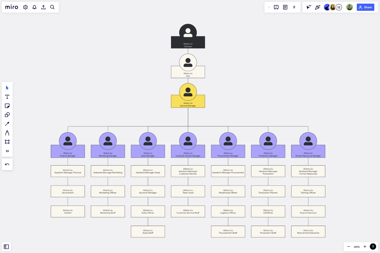
A well-defined organizational structure is crucial for effective communication and a clear understanding of roles and responsibilities within an entity. The Vertical Org Chart Template is a valuable tool that enables teams to visualize the hierarchical relationships and team dynamics in a top-down manner.
This template provides a structured representation of people and their roles within an organization, with the highest authority at the top and the hierarchy branching downwards. Each section of the template represents a tier of the hierarchy. By mapping out these relationships, one can easily understand the flow of responsibilities and communication channels within an organization.
How to use the vertical org chart template
Add your data: Begin at the topmost tier, representing the highest authority, and work your way down. Fill in each section with the appropriate title or individual's name by double-clicking the shapes.
Customize with ease: Adjust the size, color, and design of each block to match your organization's branding or to differentiate between departments. Use the context-menu bar to edit your vertical org chart features.
Expand as needed: Need to add more tiers or members? Use the automated diagramming features to add additional shapes and connector lines seamlessly.
Give more context: Beyond names and titles, you can attach any artifact to your chart, like photos, documents, or notes, to provide additional context.
Why should you use a vertical org chart template?
Visualizing the hierarchy of an organization can have several benefits, including clear communication, efficient onboarding, strategic planning, transparency, and enhanced collaboration.
Clear communication: By visualizing the hierarchy, organizations can ensure clear communication channels, reducing misunderstandings and potential conflicts.
Efficient onboarding: New members can quickly understand the organization's structure, facilitating faster integration and orientation.
Strategic planning: Decision-makers can use the chart to identify gaps, redundancies, or potential areas for expansion or consolidation.
Transparency: Employees gain clarity on reporting lines and understand their position within the broader organizational context.
Enhanced collaboration: Recognizing interconnected roles can foster collaboration between departments or teams, driving synergies and improved outcomes.
Miro is the perfect org chart creator to help visualize and understand your organization's hierarchical structure and reporting lines between roles. If you're interested in learning more about organizational charts you can read our in-depth guide.
Can the template be customized to fit large organizations?
Absolutely. The template is scalable, allowing for the addition of more tiers and entities. The automated diagramming features ensure that expanding the template remains a smooth process.
Is it possible to link external documents or websites to the chart?
Yes. Artifacts, such as documents or URLs, can be attached to any part of the chart, offering a richer context and acting as a quick reference point.
How can I differentiate between departments or teams in the chart?
The template is highly customizable. You can change colors, shapes, and designs to demarcate different departments or teams, making the visualization more intuitive.
Can the Vertical Org Chart be shared and edited collaboratively?
Indeed. Like other templates, the Vertical Org Chart allows real-time collaboration, enabling teams to jointly input, edit, and finish the organizational structure.
Get started with this template right now.
Interactive Video Storyboard Canvas
Works best for:
Diagramming
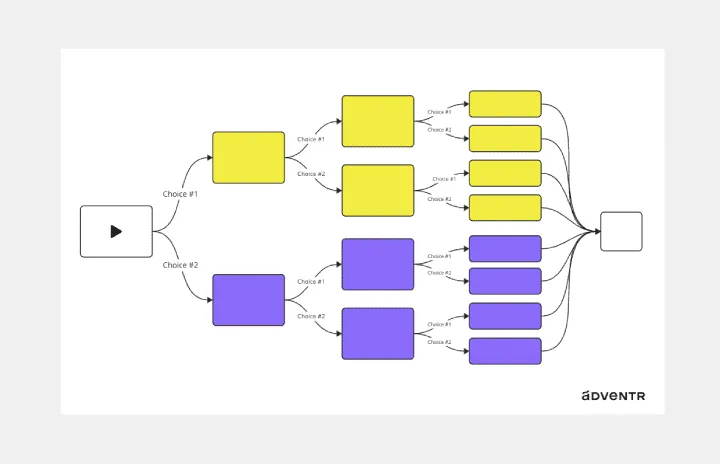
The Interactive Video Storyboard Canvas template offers a visual framework for planning and storyboarding interactive video content. It provides elements for outlining scenes, defining interactions, and visualizing user pathways. This template enables teams to design engaging and immersive video experiences, facilitating collaboration and alignment among content creators and stakeholders. By promoting creativity and interactivity, the Interactive Video Storyboard Canvas empowers teams to create compelling video narratives that captivate audiences and drive engagement.
Dichotomous Key Template
Works best for:
Diagramming
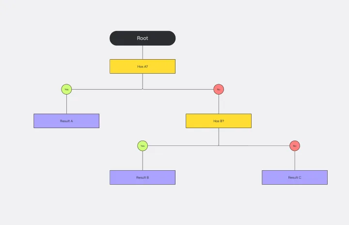
The Dichotomous Key Template stands out as an exceptional tool for simplifying complex classification processes, significantly enhancing learning experiences. Breaking down intricate subjects into a series of binary decisions transforms how information is absorbed and understood. This systematic approach not only aids in retaining intricate details but also makes the learning process more engaging and interactive. Whether for educational purposes or professional use, the template’s design fosters a deeper comprehension of the subject matter, allowing learners and professionals to navigate complex scenarios with clarity and ease.
Interrelationship Diagram
Works best for:
Diagramming
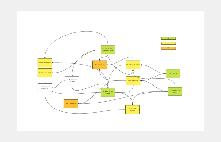
The Interrelationship Diagram template is a visual tool for analyzing and illustrating complex relationships between variables or elements within a system. It provides a structured framework for mapping out connections, dependencies, and interactions. This template enables teams to visualize patterns, identify causal relationships, and uncover insights into system behavior. By promoting systems thinking and understanding of interdependencies, the Interrelationship Diagram empowers organizations to make informed decisions and drive effective solutions to complex problems.
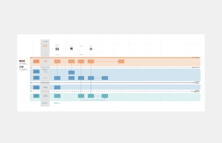
Service Blueprint
Works best for:
Diagramming
The Service Blueprint template is a visual tool for designing and optimizing service experiences. It provides a structured framework for mapping customer journeys, identifying touchpoints, and aligning internal processes. This template enables teams to visualize the entire service ecosystem, uncover pain points, and innovate solutions to enhance customer satisfaction. By promoting customer-centricity and collaboration, the Service Blueprint empowers organizations to deliver exceptional service experiences and drive sustainable growth.
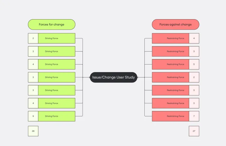
Force Field Analysis Template
Works best for:
Diagramming, Strategic Planning
A Force Field Analysis Template is a powerful tool that helps teams identify and analyze the forces supporting or hindering progress toward a specific change or goal. This template provides a visual space where you can brainstorm and plot out 'driving forces' that push objectives forward and 'restraining forces' that prevent advancement, all on a single, intuitive board. One of the primary benefits of utilizing the Force Field Analysis template is that it fosters a shared understanding among team members. By visually mapping out and discussing each force, teams can prioritize efforts, build consensus on the central issues to tackle, and collaboratively devise strategic plans to strengthen positive influences while reducing negative ones.
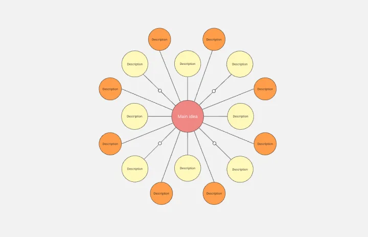
Bubble Map Template
Works best for:
Diagramming, Mapping, Brainstorming
A Bubble Map Template is a visual organization tool that uses bubbles or circles to represent various ideas or data points. These bubbles are linked together, displaying their relationships and creating a network of interconnected thoughts. Use a Bubble Map Template to streamline complex information, enhancing comprehension and promoting efficient decision-making.