Pie Chart Template
Present relationships between datasets and see contrast right away with the pie chart template.
Trusted by 65M+ users and leading companies


About the Pie Chart Template
A pie chart template shows the relationships between datasets, illustrated within a circle. It’s often also referred to as a circle chart. The circle sections look like slices of a pie and represent different datasets so that you can easily compare them all at once. The Pie Chart Template is an excellent tool to enhance presentations and make data more digestible to any audience.
What is the pie chart template
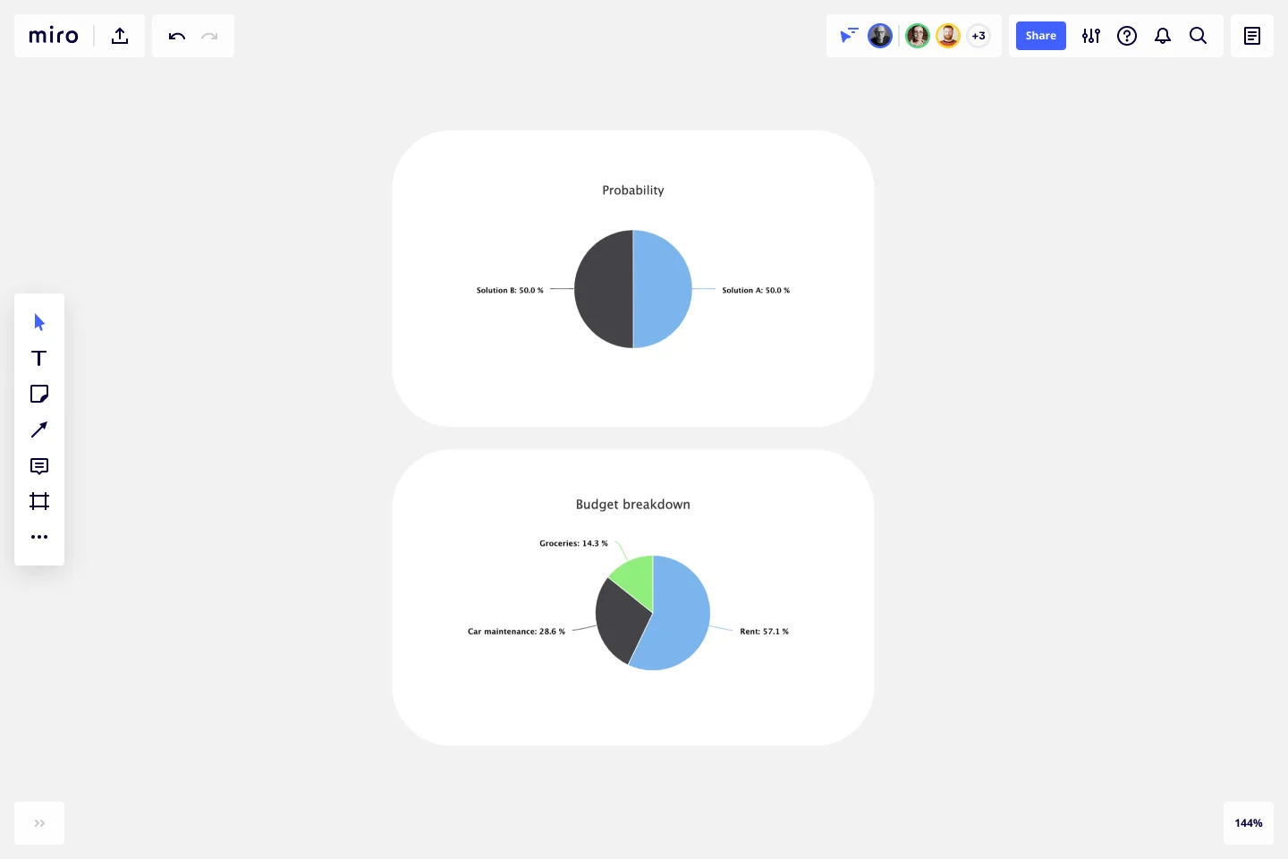
The pie chart template is a circle with sections, representing the pie ‘slices’, with the arc’s length being proportional to the quantity represented. The sections making up the pie chart, often displayed in percentages, are equal to 100% when added up, making a full circle.
When to use the pie chart template
Professionals across many industries use pie charts to compare data and show contrasts. It’s one of the most used diagrams since it can be easily read and interpreted.
Business organizations and the educational sector use pie charts and other graphs to support storytelling with visual data, and engage audiences easily and more quickly.
How to create a pie chart
You can easily make a pie chart in Miro, either using our ready-made template or drawing one from scratch. Miro’s extensive diagramming capabilities make it the perfect pie chart maker, where you can, with just a few clicks, create your own pie chart.
How to make a pie chart using our ready-made template:
Select the pie chart template.
Double-click the pie chart to add data to each series. Make sure to add real numbers and not percentages.
Edit title and legend.
After you set your pie chart, you can edit how it looks and change the colors as you like.
How to create a custom pie chart:
Click ‘charts’ on the toolbar.
Select the object, in this case, the pie chart.
Double click the pie chart. A pop-up window will show.
Add your data.
In Miro, you can edit the values of your pie chart, and the colors will be selected automatically.
A pie chart example
Let’s say you want to save on your water consumption. To analyze how much water you are using, you can create a pie chart to show all the ways you consume water and how much water each of them uses. You can add toilet consumption, shower, kitchen sink, washing machine, dishwasher, and any leakages. For each of these, add the percentage of their consumption.
As you can see, the total consumption should be 100%, which will configure your whole pie chart.
With this pie chart, you can see right away which one has the most significant share of consumption and which one has the lowest.
Where can I create a pie chart?
People often create a pie chart to visually show data when doing presentations or delivering reports. Miro is an excellent pie chart maker, where you can easily create your pie chart and attach it to any other document by either downloading or embedding your pie chart template board. Highly customizable, our pie chart template is also easily shareable so you and your team can add ideas and make communication flow easier with it. Try it for yourself and see if that works for you.
Get started with this template right now.
Data Flow Diagram Template
Works best for:
Flowcharts, Software Development, Diagrams
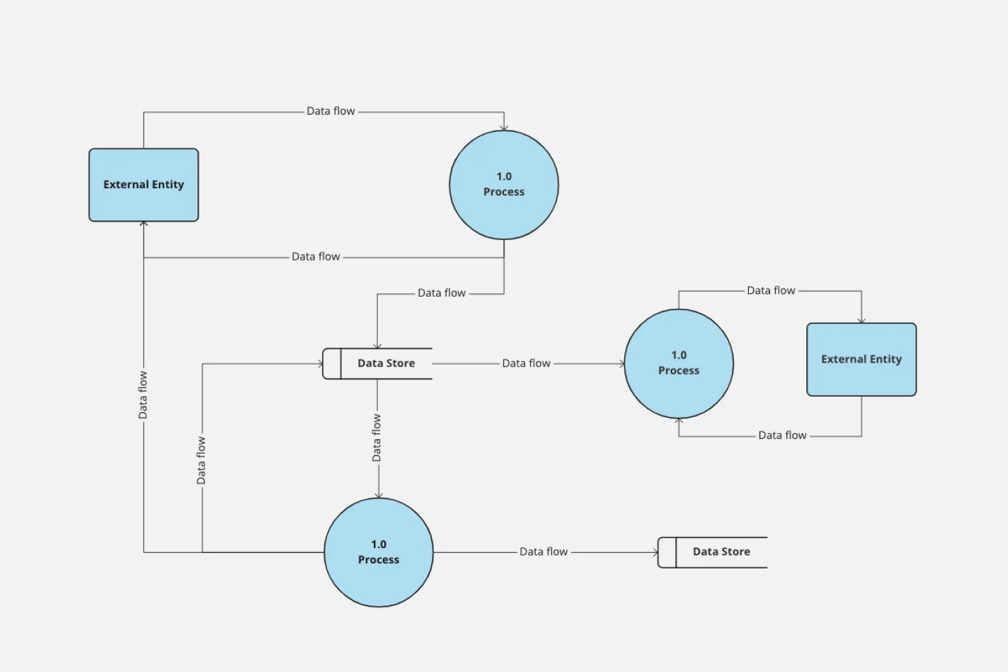
Any process can get pretty complex, especially when it has multiple components. Get a better grasp of your process through a data flow diagram (DFD). DFDs create a simple visual representation of all components in the flow of data and requirements in an entire system. They’re most often used by growth teams, data analysts, and product teams, and they’re created with one of three levels of complexity—0, 1, or 2. This template will help you easily build the best DFD for your process.
Kinship Diagram Template
Works best for:
Mapping
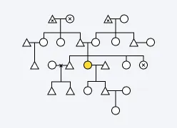
Use a Kinship Diagram Template to map out a clear picture of your family relationships. With clear guidelines for kinship notation, you can navigate everything from your closest uncle to your third cousin twice removed. Try the Kinship Diagram Template to understand your family relationships.
Azure Demand Forecasting Template
Works best for:
Software Development, Diagrams
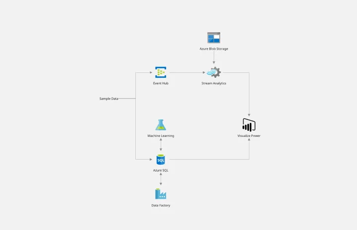
The Azure Demand Forecasting diagram will show the architecture of a demand forecast, making it easier for you to predict data consumption, costs, and forecast results. Azure is Microsoft’s cloud computing platform, designed to provide cloud-based services such as remote storage, database hosting, and centralized account management. Azure also offers new capabilities like AI and the Internet of Things (IoT).
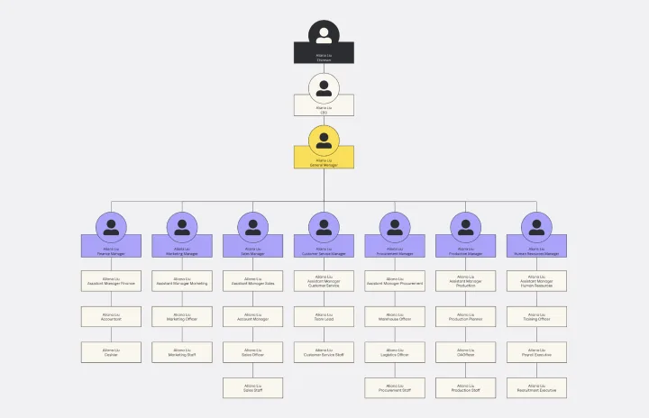
Vertical Organizational Chart
Works best for:
Organizational Charts, Organizational Design
The Vertical Organizational Chart Template is an efficient way to illustrate the hierarchy of an entity in a top-down format. This tool helps represent roles and relationships in a clear manner, starting from the topmost authority and branching downwards. It allows for a better understanding of the flow of responsibilities and communication channels within the organization. One of its most significant advantages is promoting clear communication. Depicting the organization's structure helps avoid misunderstandings and ensures everyone is on the same page regarding the chain of command.
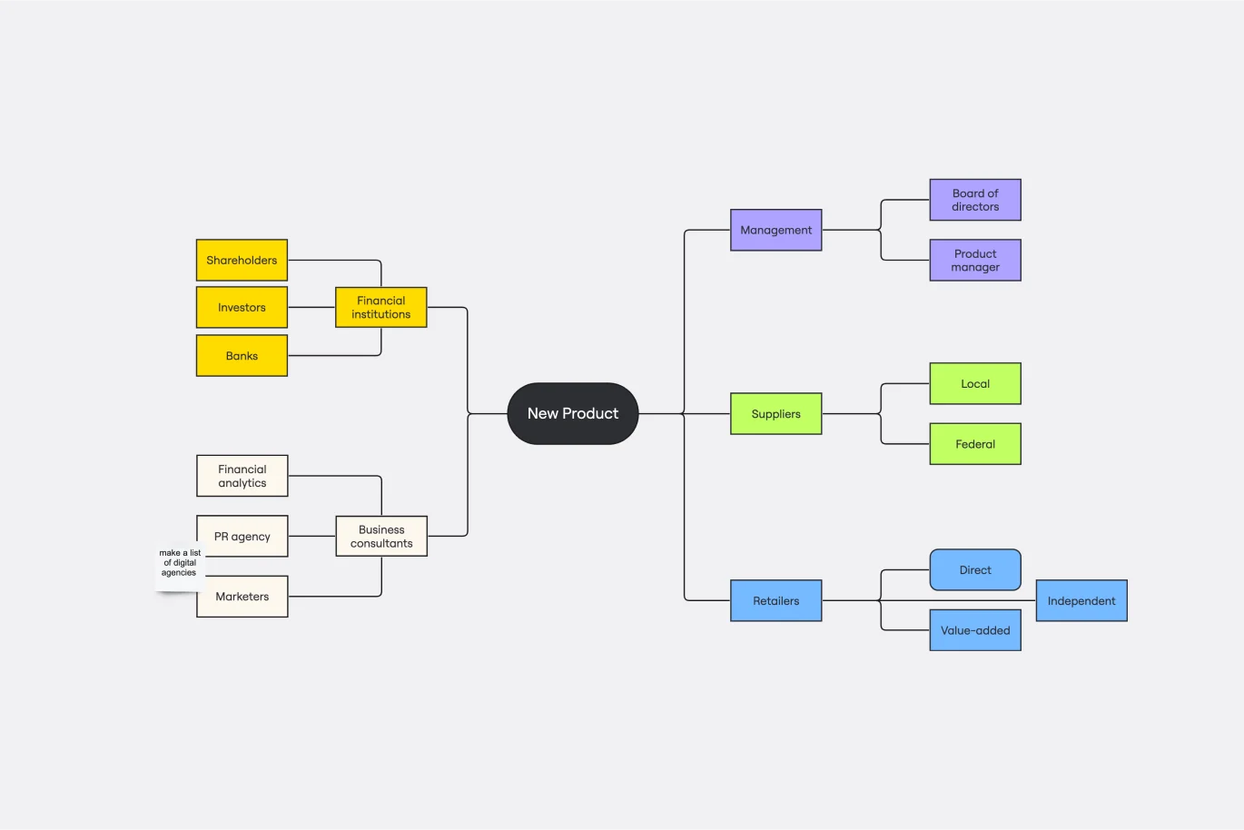
Stakeholder Mapping Template
Works best for:
Business Management, Mapping, Workflows
A stakeholder map is a type of analysis that allows you to group people by their power and interest. Use this template to organize all of the people who have an interest in your product, project, or idea in a single visual space. This allows you to easily see who can influence your project, and how each person is related to the other. Widely used in project management, stakeholder mapping is typically performed at the beginning of a project. Doing stakeholder mapping early on will help prevent miscommunication, ensure all groups are aligned on the objectives and set expectations about outcomes and results.
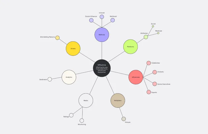
Cluster Diagram Template
Works best for:
Diagramming
The Cluster Diagram Template is a valuable tool for organizing and connecting ideas, concepts, and information in a visually compelling and coherent manner. The template's design centers on grouping related ideas around a core concept, creating a transparent and hierarchical structure. This clustering not only aids in breaking down complex information into manageable segments but also significantly enhances the process of idea generation and brainstorming. A structured yet flexible visual framework encourages deeper engagement and more precise understanding, making it an essential asset for teams and people looking to bring order to their creative and analytical processes. I have checked the text for any potential spelling, grammar, and punctuation errors, and it's good to go.