Influence Diagram Template
Build a clear picture of exactly what impacts your business decisions with the influence diagram template.
Trusted by 65M+ users and leading companies


About the Influence Diagram Template
Making business decisions can be difficult, as it can be hard to understand everything that influences your decisions. An influence diagram helps simplify the decision-making process by allowing you to understand it from a high level.
Keep reading to learn more about our Influence Diagram Template.
What is an Influence Diagram?
An Influence Diagram visualizes the factors impacting a decision at a high level. It defines what you need to decide, the factors that you can and can’t control, and the possible outcomes that you can evaluate to see if they meet your needs.
Influence Diagrams are less complex than some other decision-making visualizations, such as Decision Trees. Where a Decision Tree diagram maps out each possible decision in detail, much like a flowchart, an Influence Diagram lets you think and rethink each factor as often as you need.
Benefits of using an Influence Diagram
Making decisions is hard in any context. An Influence Diagram gives you a high-level picture of key decisions so that you have all the information you need to make the best choice.
Since influence diagrams are a simple visual representation, they’re easy for everyone to understand. The standard notation — more on that later — creates an easy view of the types of factors involved, so employees, executives, and stakeholders alike can understand what’s at play.
The Influence Diagram can be used by a range of business professionals — it’s useful for anyone wanting to improve their decision-making capability.
In a project management context, influence diagrams are important for mitigating risk and predicting uncertainty that could lead to poor project outcomes.
When strategic planning, influence diagrams can help you choose the best course of action for the future of your business.
Create your own Influence Diagram Template
With Miro, you can create an Influence Diagram with just a few easy steps. You’ll be able to refine the influences or reframe your decision as you go. To get started, open up the Influence Diagram Template. Then follow these steps:
Step 1:
Define the decision you have to make as concisely as possible. This could be a yes or no question or a decision that needs a value, such as a budget. Enter your decision in the rectangle in the template.
Step 2:
Make a list of everything that could influence the decision. You can easily create your list in Miro and share your thoughts with others for their input. Some of your factors might depend on each other, or they might vary based on information you don’t yet have.
Step 3:
Assign the right notation to each factor in your Influence Diagram.
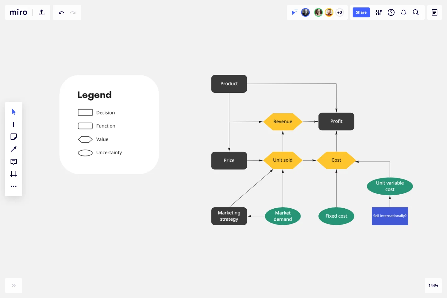
Influence diagrams use a standard notation to help you see what kind of decision variable you’re working with. There are four main types of nodes you’ll use:
Decision (rectangle): the root question you are trying to answer.
Uncertainty (oval): variables you may not know or be able to control.
Function (rounded rectangle): variables that may be calculated or influenced by factors you can control.
Value (hexagon): the final outcome of the decision, which you can evaluate to determine if it aligns with your business needs.
Step 4:
Draw arrows between nodes to represent paths of influence, dependence, or relevance. What the arrows represent depends on the type of node they point to.
For example, in our pre-filled Influence Diagram Template, the arrow originating from the decision node indicates that the decision to sell internationally depends on the unit variable cost.
In another part of the template, arrows indicate that market demand and the marketing strategy influence the number of units sold.
You don’t have to draw arrows between all of your nodes. In fact, the lack of an arrow can sometimes convey a lot about the path of influence in a decision.
Step 5:
Go back to your original decision node and follow the paths of influence throughout your diagram. You might find that you need to make a few changes.
For instance, you might refine some of your uncertainties or think differently about how these factors relate to each other. An influence diagram is a tool to help you think in real-time, so don’t be afraid to make lots of changes as you think through your decision.
Example of an effective Influence Diagram
Let’s take a look at the simple Influence Diagram example included in our pre-filled template. The rectangle in the bottom right-hand corner represents the decision: should the business sell internationally?
The outcome of this decision will impact the unit variable cost, an uncertainty represented by an oval. We know the direction of impact because of the arrow. In turn, the unit variable cost, once known, will influence the overall cost to the business.
From here, you can follow the nodes and arrows in this influence diagram example to further understand how these variables impact each other, the overall outcomes, and the final decision.
Why is an Influence Diagram important?
Creating an Influence Diagram is a fast and reliable technique for understanding influence and risks in a given scenario. By looking at decisions at a high level, you can build an easy-to-understand visualization of complex and important problems. This way, you and your team can develop a deeper understanding of the decision at hand.
What are the two meanings of an arrow in an Influence Diagram?
In an Influence Diagram, arrows mean either dependence or relevance. The exact meaning of the arrow depends on the type of node it's pointing to. An arrow from an uncertainty node to a value node indicates that the value is dependent on the uncertainty. An arrow from an uncertainty node to a function node could indicate information you need to gather before determining the function.
What’s the difference between a Decision Tree Diagram and an Influence Diagram?
An Influence Diagram approaches a decision from a high level. It considers the most significant factors affecting a decision, how certain you can be about those factors, and what other information you might need to make your decision. A Decision Tree Diagram is much more complex. It covers a series of decisions and their potential outcomes. When you create one, you essentially develop a series of yes or no questions that cover all possible alternatives to a scenario.
Get started with this template right now.
Affinity Diagram by UserPeek
Works best for:
Diagramming
The Affinity Diagram template is a visual tool for organizing and categorizing ideas, data, or issues into related groups. It provides a structured framework for conducting group brainstorming and affinity grouping activities. This template enables teams to synthesize information, identify patterns, and generate insights collaboratively. By promoting creativity and collaboration, the Affinity Diagram empowers teams to organize and prioritize information effectively, driving decision-making and problem-solving processes efficiently.
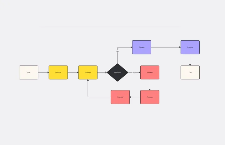
Flowchart Template
Works best for:
Flowcharts, Mapping, Diagrams
Trying to explain a process or workflow to your team — or just wrap your head around it yourself? Sometimes the best way is to see it, and that’s when you create a flowchart. Using common shapes (generally just ovals, rectangles, diamonds, and arrows), a flowchart shows you the direction a process or workflow goes and the order of steps. Beyond giving you a clear understanding, you’ll also be able to see potential flaws and bottlenecks, which helps you refine and improve your process and create a better product more efficiently.
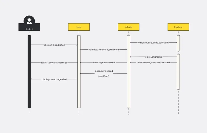
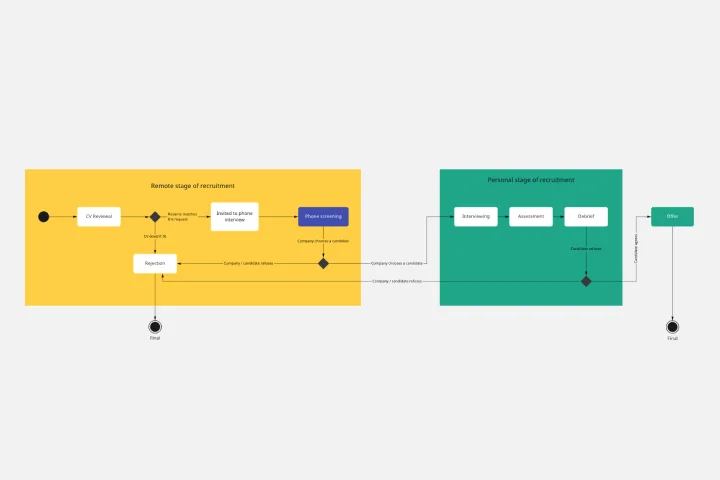
Login Sequence Diagram Template
Works best for:
Diagramming, Technical Diagramming
The UML Sequence Login Diagram Template is a valuable tool for visualizing user authentication processes. It breaks down complex login sequences into clear, visual components, facilitating collaborative understanding among team members, regardless of their technical expertise. This shared understanding is crucial for ensuring all stakeholders, from developers to project managers, are on the same page, leading to efficient decision-making and a smoother development process. The template's ability to translate technical details into an accessible format streamlines communication and significantly reduces the likelihood of misinterpretation or oversight, making it an essential asset in any software development project.
UML State Machine Diagram Template
Works best for:
Software Development, Mapping, Diagrams
Visualize the workflow of a process and how objects perform actions based on different stimuli. State machine diagrams are valuable for understanding how an object responds to events at the different stages of its life cycle. They are also helpful for visualizing event sequences in a system.
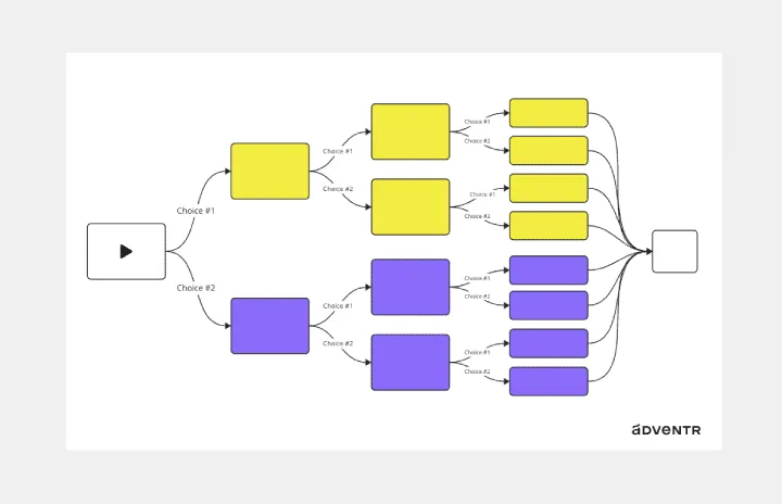
Interactive Video Storyboard Canvas
Works best for:
Diagramming
The Interactive Video Storyboard Canvas template offers a visual framework for planning and storyboarding interactive video content. It provides elements for outlining scenes, defining interactions, and visualizing user pathways. This template enables teams to design engaging and immersive video experiences, facilitating collaboration and alignment among content creators and stakeholders. By promoting creativity and interactivity, the Interactive Video Storyboard Canvas empowers teams to create compelling video narratives that captivate audiences and drive engagement.
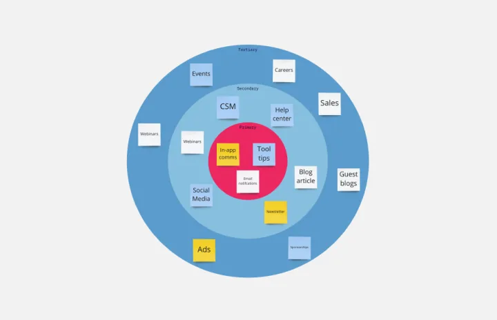
Bull's Eye Diagram Template
Works best for:
Diagrams, Project Management, Prioritization
When you’re a growing organization, every decision can feel like it has make-or-break consequences—which can lead to decision paralysis, an inability to prioritize, inefficient meetings, and even low morale. If that sounds like you, put a Bull’s Eye Diagram to work. True to its name, a Bull’s Eye Diagram uses a model of concentric circles to help companies establish priorities, make critical decisions, or discuss how to remove or overcome obstacles.