Kinship Diagram Template
Understand complex family relationships with a Kinship Diagram Template that keeps your relatives organized.
Trusted by 65M+ users and leading companies


About the Kinship Diagram Template
Understanding how we relate to distant relatives is simple using a kinship diagram. It allows you to map out relationships without getting hung up on specific names or other pieces of information. While most commonly used by anthropologists and genealogists, a kinship diagram can be a useful tool for anyone interested in family relationships.
Keep reading to learn more about our Kinship Diagram Template.
What is a kinship diagram?
A kinship diagram is a chart outlining relationships in a family, society, or culture. In many ways, kinship diagrams are similar to family trees. But instead of listing specific names or modeling the diagram after one family, kinship diagrams are used more generally to understand how most families in a culture work.
Kinship diagram charts are most commonly used in the field of anthropology. Researchers can use kinship notation to quickly sketch social relationships as they interview subjects.
But you don’t have to be a professional anthropologist to get use out of a kinship diagram — anyone interested in family history or genealogy might find a use for it.
Benefits of a kinship diagram
Kinship diagrams are an easy way to see how family, cultural, and societal patterns play out. Often, a kinship diagram helps convey not just the family roles themselves but which relatives hold the most influence over the family.
You can also use a kinship diagram to navigate complex family roles. If you’re trying to understand third or fourth cousins, a kinship diagram can help you see where they fall in relation to you without getting hung up on specific names.
Create your own kinship diagram
You can get started on a kinship diagram very quickly. Simply open up the Kinship Diagram Template and follow the steps below:
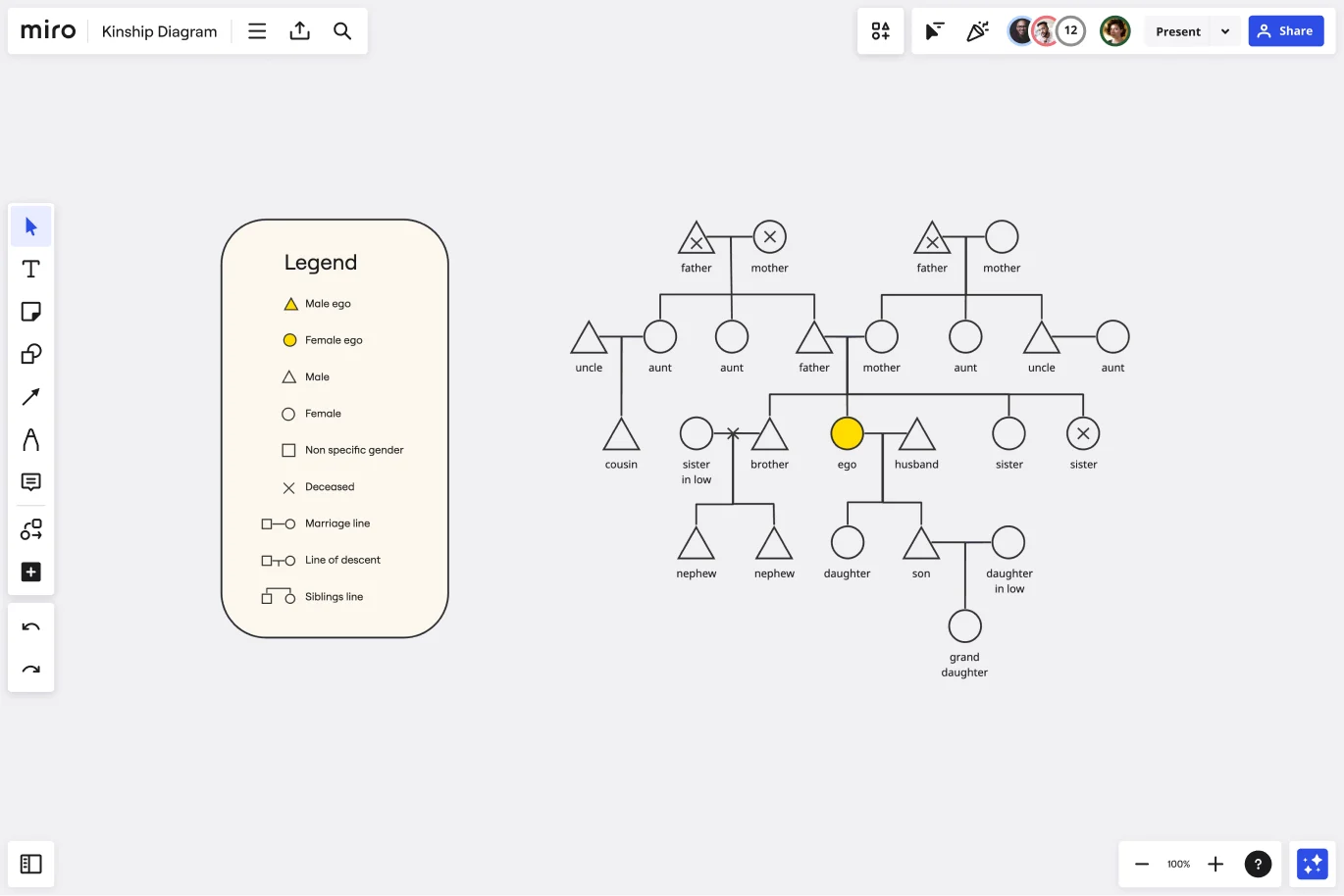
Step 1: Add “Ego,” or the starting point of your kinship diagram.
All of the relatives in the diagram will be listed in relation to Ego. When you add people to the kinship diagram, you can use the following shapes to denote gender:
Triangle: Male
Circle: Female
Square: Nonspecific gender
When you add in Ego on our Kinship Diagram Template, it will default to blue. Filling in Ego helps you find the starting point of your kinship diagram even when it’s incredibly complex.
Step 2: Build out Ego’s immediate relationships.
This can include parents, siblings, children, and partners. Be sure to use the right shapes to represent the appropriate gender for each relative.
Show connections between relatives with solid lines. A horizontal line between two people represents marriage. A vertical line descending from a marriage line represents children.
To represent siblings, draw a horizontal line at the bottom of a childline. Then, draw an additional vertical line for each sibling.
Step 3: Continue to build out the diagram using kinship notation.
Add grandparents, aunts, uncles, cousins, and more until you have a full picture of your family system.
Step 4: Mark various life events.
If you’re mapping out a real family system rather than a representative one, you can use kinship notation to mark deaths, divorces, and other life events.
Place an X over the shape for any deceased relatives. You can also use a / to note marriages that ended due to divorce or death.
Step 5: Add notes or comments to record additional information.
You can turn your kinship diagram into a family tree diagram, genogram, or pedigree chart by adding more information about life events and family relationships. If you prefer, Miro has a ready-to-use genogram template or a pedigree template that you can get started with.
If you’re working with other family members or a dedicated genealogist, you can invite them to collaborate on your kinship chart by adding their own findings. As you work together to learn more about your family system, you can easily share and edit the kinship diagram to meet your needs.
Use case for a kinship diagram
When it comes to family history research, a kinship diagram can serve as a great starting point before diving into a full-fledged family tree. Instead of getting lost in the weeds of finding your great-grandmother’s birth certificate, you can use Miro's easy family tree builder to sketch out your entire family system as you plan the best way to approach your family research.
Kinship diagrams can be used for much quicker purposes too. If you’re trying to figure out how exactly a distant relative fits into your family tree or want to know the precise term for that relation, a kinship diagram provides an easy visual to help you find the answer.
Who can use a Kinship Diagram Template?
If you’re interested in understanding a family or social relationship in any context, then you can use the Kinship Diagram Template. Because kinship diagram charts are simplified and standardized, they are a great way to dip your toes into genealogy and family research. You can get a handle on how people are related to each other before diving into public records and family documents.
What is kinship notation?
Kinship notation is a system of symbols that anthropologists and genealogists use to map our family and social structures. In kinship notation, shapes represent gender — triangle for male, circle for female, and square for nonspecific — and lines represent immediate relationships. In kinship notation, you can also use X or / to indicate deaths or broken relationships.
What’s the difference between a family tree and a kinship diagram?
A kinship diagram maps out broad family and social structures as they most commonly exist in a culture. A family tree is a specific, personal history of one family that includes information about births, deaths, marriages, and other life events.
Get started with this template right now.
Opportunity Solution Tree Template
Works best for:
Flowcharts, Product Management, Diagrams
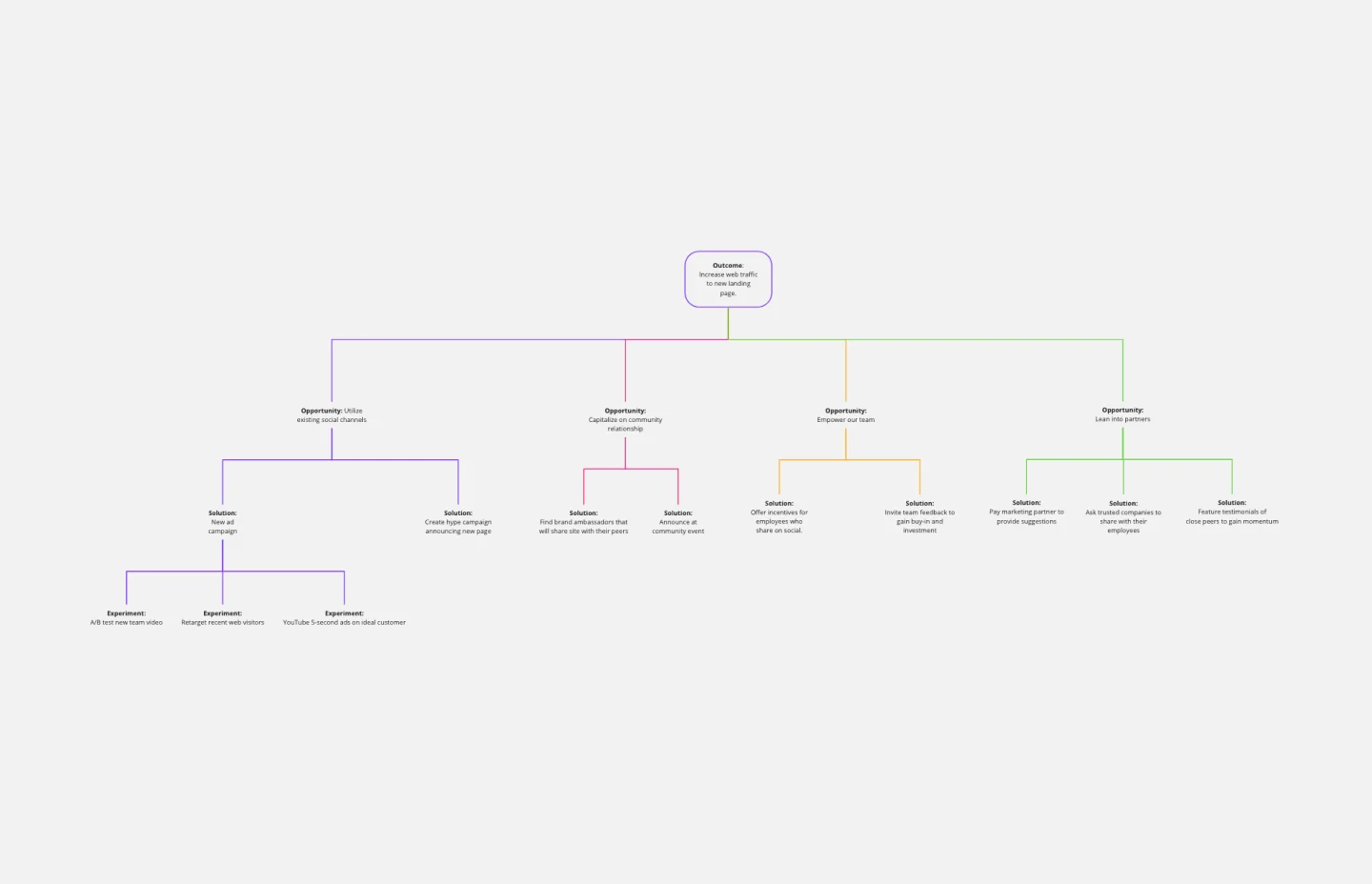
Solving problems — successful companies and productive teams just know how to do it. They’re able to identify many possible solutions, then settle on the one that leads to the desired outcome. That’s the power an Opportunity Solution Tree gives you. Designed by Teresa Torres, a product discovery coach, this mind map breaks down your desired outcome into opportunities for the product to meet user needs, then gives your team an effective way to brainstorm potential solutions.
Objectives and Key Results (OKRs) Template
Works best for:
Leadership, Strategic Planning, Project Planning
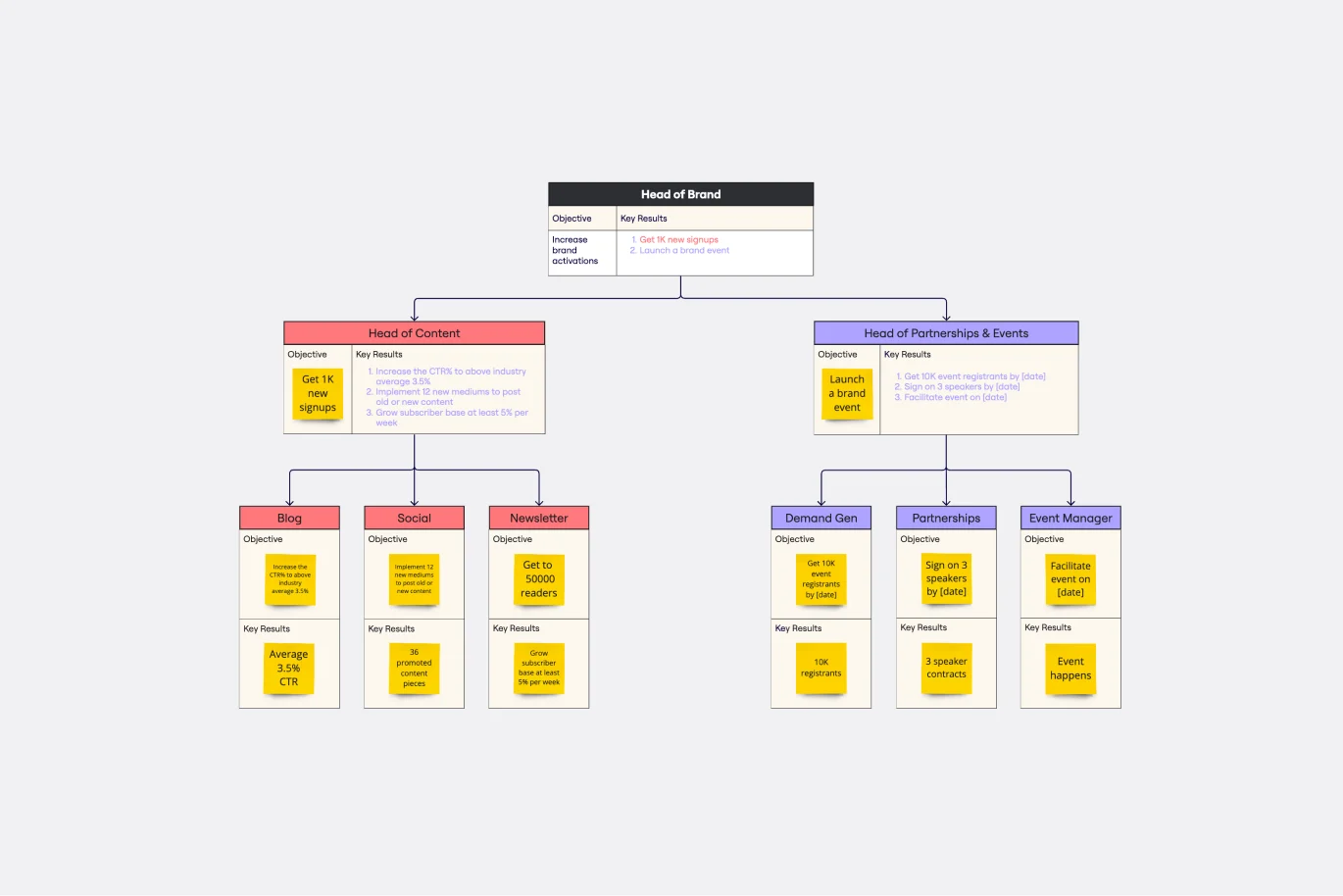
Clarity, focus, and structure — those are the key ingredients to feeling confident in your company’s directions and decisions, and an OKR framework is designed to give them to you. Working on two main levels — strategic and operational — OKRs (short for objectives and key results) help an organization’s leaders determine the strategic objectives and define quarterly key results, which are then connected to initiatives. That’s how OKRs empower teams to focus on solving the most pressing organizational problems they face.
Onion Diagram Template
Works best for:
Diagramming, Mapping and Diagramming
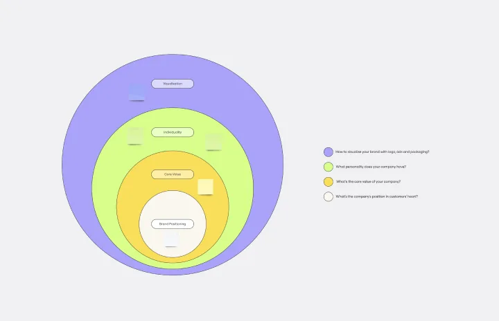
The Onion Diagram Template is a distinct tool designed to visually represent layers of a specific concept, system, or process, akin to the layers of an onion. Each concentric layer of the diagram provides insights into a different aspect or phase of the topic at hand, moving from the core foundational element outwards to more peripheral components. One of the prime benefits of this template is its ability to offer hierarchical clarity. Users can immediately discern the importance, sequence, or interrelation of different elements within a system, facilitating enhanced comprehension and efficient decision-making.
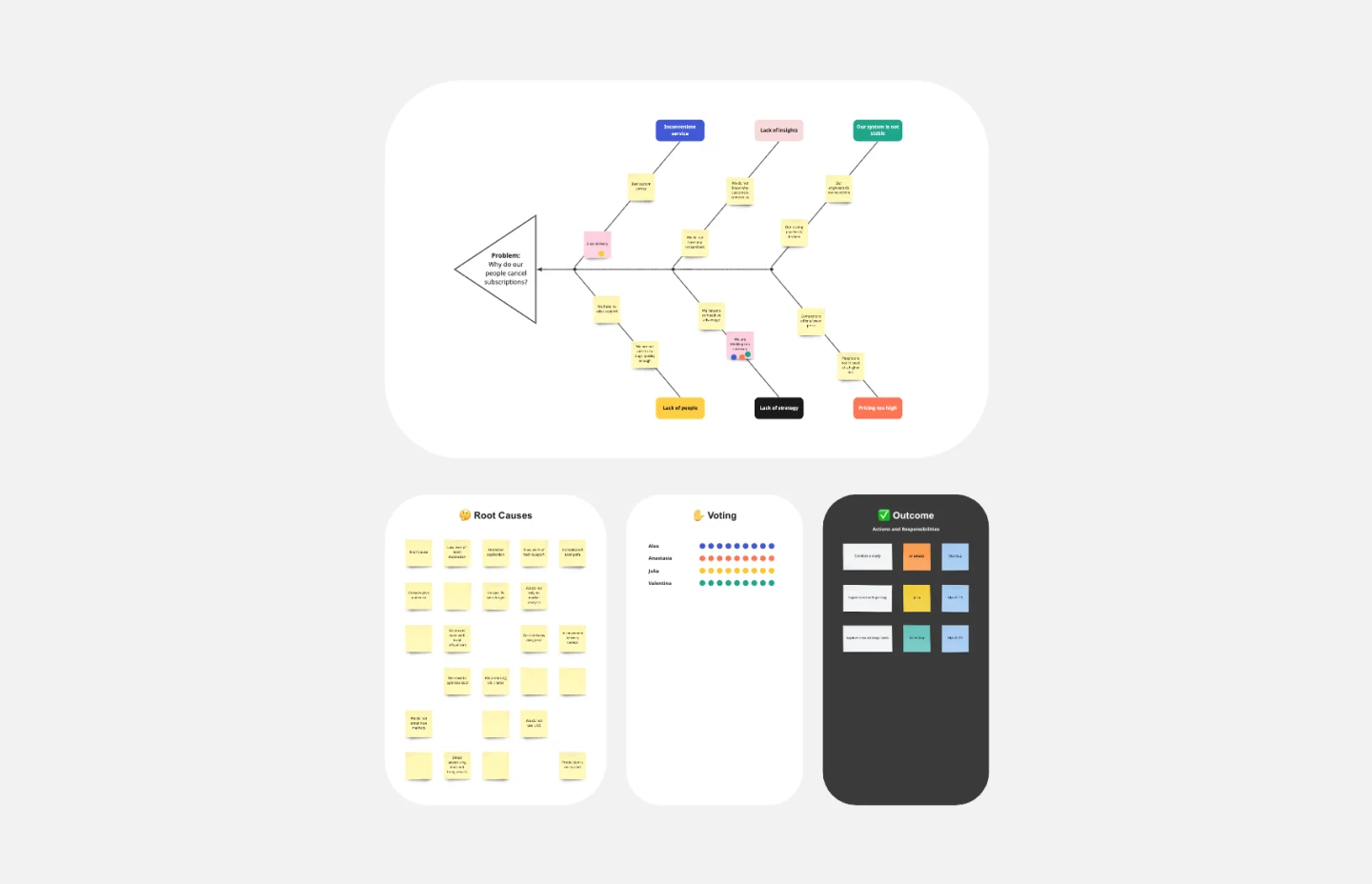
Fishbone Diagram Template
Works best for:
Operations, Diagrams, Workflows
What is the best way to solve any problem your team faces? Go straight to the root. That means identifying the root causes of the problem, and fishbone diagrams are designed to help you do it best. Also known as the Ishikawa Diagram (named after Japanese quality control expert Kaoru Ishikawa), fishbone diagrams allow teams to visualize all possible causes of a problem, to explore and understand how they fit together holistically. Teams can also use fishbone diagrams as a starting point for thinking about what the root cause of a future problem might be.
UML State Machine Diagram Template
Works best for:
Software Development, Mapping, Diagrams
Visualize the workflow of a process and how objects perform actions based on different stimuli. State machine diagrams are valuable for understanding how an object responds to events at the different stages of its life cycle. They are also helpful for visualizing event sequences in a system.
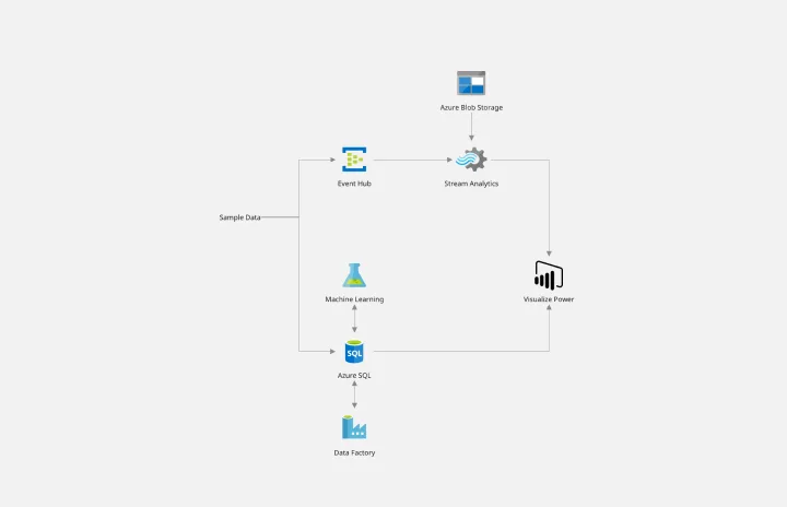
Azure Demand Forecasting Template
Works best for:
Software Development, Diagrams
The Azure Demand Forecasting diagram will show the architecture of a demand forecast, making it easier for you to predict data consumption, costs, and forecast results. Azure is Microsoft’s cloud computing platform, designed to provide cloud-based services such as remote storage, database hosting, and centralized account management. Azure also offers new capabilities like AI and the Internet of Things (IoT).