HEART Framework Template
Evaluate customer satisfaction and ensure that you are providing real value with the HEART Framework. Measure Happiness, Engagement, Adoption, Retention, and Task Success.
Trusted by 65M+ users and leading companies


About the HEART Framework template
The HEART framework is a UX framework developed by Google. It turns the often-fuzzy idea of user experience into a set of measurable, actionable metrics, helping your product win new users and keep current active users loyal.
What is the HEART framework?
User experience teams often find it challenging to develop useful metrics for success. It’s an even greater challenge for teams at large companies. You can measure user experience at a small scale through user research, surveys, and focus groups. But as your company grows, your customer base gets too large for these methods to always be reasonable.
Google developed the HEART framework to tackle the problem of quantifying user experience. The HEART framework is a set of user-centered metrics you can use to measure user experience at any scale — then draw on those metrics repeatedly throughout the product development lifecycle.
What does HEART stand for?
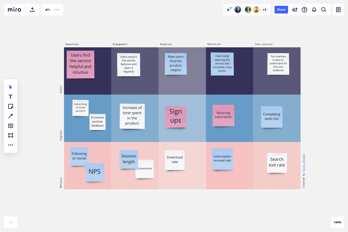
HEART stands for Happiness, Engagement, Adoption, Retention, and Task Success.
Happiness is a subjective measure of attitude or satisfaction. It’s often quantified through user surveys and bolstered via case studies.
Engagement measures how much the user interacts willingly with a product. Depending on the product, it can be measured by your number of active users in a day, week, or month or your net promoter score (NPS).
Adoption is the rate of new users gained in each time period, usually monthly.
Retention measures how long each customer remains an active user before dropping off. Churn, the other side of the coin, measures how many active users go inactive each month.
Task Success is either the average time it takes a user to complete a task in your product or the percentage of tasks users successfully complete.
What are goals, signals, and metrics in HEART?
Goals, signals, and metrics are the core of the HEART process. All five areas of the HEART acronym must be connected to a goal, at least one signal, and at least one metric.
A goal is a statement of what you’d like your product to achieve in that area of HEART. It’s important for goals to be general, not defined by existing metrics. Some examples:
Happiness goal: “We want logging into our product to feel relaxing and supportive.”
Engagement goal: “We want users engaging with our app every day.”
Adoption goal: “We want our user base to grow continuously.”
Retention goal: “We want as little churn as possible.”
Task Success goal: “We want to minimize abandoned tasks across all user segments.”
Next, come up with one or more signals for each goal. Signals are signs you can look for to show you whether you’re on track to achieve your goal. Examples might be:
Happiness signals: Positive feedback from with real users, recommendations, few complaints.
Engagement signals: Large amount of user-generated content, users spending more time in the app, users logging in multiple times per day.
Adoption signals: More downloads, new features adopted quickly, paid features generating more revenue.
Retention signals: More subscription renewals, fewer users going inactive.
Task Success signals: Few abandoned tasks, few complaints about time-to-completion.
Finally, decide on metrics you can use to objectively measure each signal. For example:
Happiness metrics: Number of five-star reviews, NPS.
Engagement metrics: Daily/weekly/monthly active users.
Adoption metrics: New users per day/week/month, revenue from paid users.
Retention metrics: Retention rate, churn rate.
Task Success signals: Tasks completed per user, average completion time.
The HEART framework is not prescriptive. You’re free to come up with whatever goals, signals, and metrics make the most sense for your business and product.
How do you create a HEART model?
Start by selecting the HEART framework template. Then follow these steps:
Decide on your scope. Are you evaluating your whole product, certain features, or just one feature?
Get familiar with the template. The five areas are listed at the top of the table. Goals, signals, and metrics run down the left-hand side.
Fill out goals for each column. Brainstorm or with your team to settle on five goals.
Fill out signals. Signals can be either positive (something you want to see) or negative (something you’re on the right track if you don’t see).
Fill out metrics. Pick metrics you can use to quantify each signal.
Alternately, you might choose to come up with goals, signals, and metrics for each column before moving on to the next one. Either approach works!
Once finished, you can share your framework with your team or anyone else who would benefit from seeing the information by sending them the board link.
When should you use the HEART model?
The HEART model is generally used to measure larger scale projects, but it works for any size project or team. Use it whenever you want to ensure you’re making your customers happy and providing them with real value.
What are UX frameworks?
A UX framework is a set of assumptions and steps a team can use to build a user experience. UX frameworks such as HEART also monitor and refine user reactions to a product once it’s already out in the world.
What is a KPI in UX design?
A KPI, or key performance indicator, is a measurable variable a UX team can use to determine how their user interface is performing with customers. In the HEART framework, it’s called a metric. Examples include monthly active users and time to complete tasks.
What is UX tracking?
UX tracking is the act of using tools to follow how users interact with your product. It encompasses a wide range of technology, including website analytics, click-tracking, and A/B testing apps.
How do you use the HEART framework?
The easiest way is to use this free template. Alternatively, create a table and label one axis with Happiness, Engagement, Adoption, Retention, and Task Success. Label the other axis with Goals, Signals, and Metrics. Then, work with your UX team to fill in each cell.
Get started with this template right now.
Kano Model Template
Works best for:
Desk Research, Product Management, Prioritization
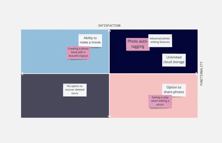
When it comes down to it, a product’s success is determined by the features it offers and the satisfaction it gives to customers. So which features matter most? The Kano model will help you decide. It’s a simple, powerful method for helping you prioritize all your features — by comparing how much satisfaction a feature will deliver to what it will cost to implement. This template lets you easily create a standard Kano model, with two axes (satisfaction and functionality) creating a quadrant with four values: attractive, performance, indifferent, and must-be.
Lesson Reflection Template
Works best for:
Education, Meetings
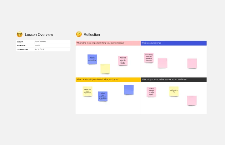
The Lesson Reflection template is a tool to create space for self-reflection and improvement. Students can evaluate the key takeaways from a lesson and what are the topics they find most interesting. As teachers receive the student’s Lesson Reflection, they can look for opportunities to improve learning and teaching methodologies. The Lesson Reflection template can help you facilitate the educational process, and it’s easy to use and straightforward.
Working Backwards Template
Works best for:
Desk Research, Strategic Planning, Product Management
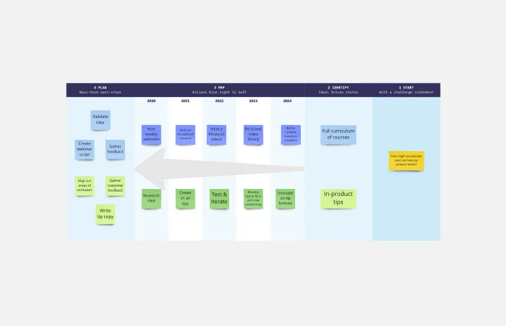
Find out how to use the Working Backwards template to plan, structure, and execute the launch of a new product. Using the template, you’ll figure out if the product is worth launching in the first place.
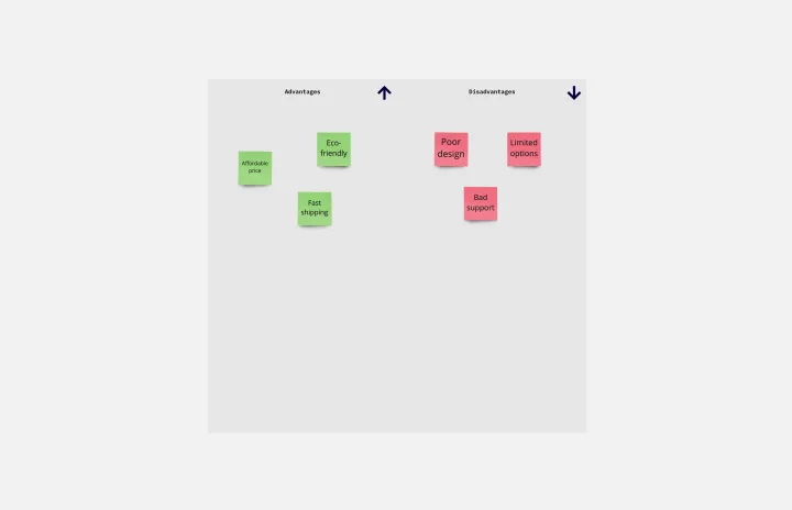
T-Chart Template
Works best for:
Ideation, Operations, Strategic Planning
T-Charts can help you compare and contrast two different ideas, group information into different categories, and prove a change through “before” and “after” analysis. T-Charts are visual organizational tools that enable you to compare ideas, so you can evaluate pros and cons, facts and opinions, strengths and weaknesses, or big-picture views versus specific details. Designers and content creators can use T-Charts to turn possibilities into actionable ideas. T-Charts are useful for discussing differences and similarities with your team or clients and can help you to reach a decision together.
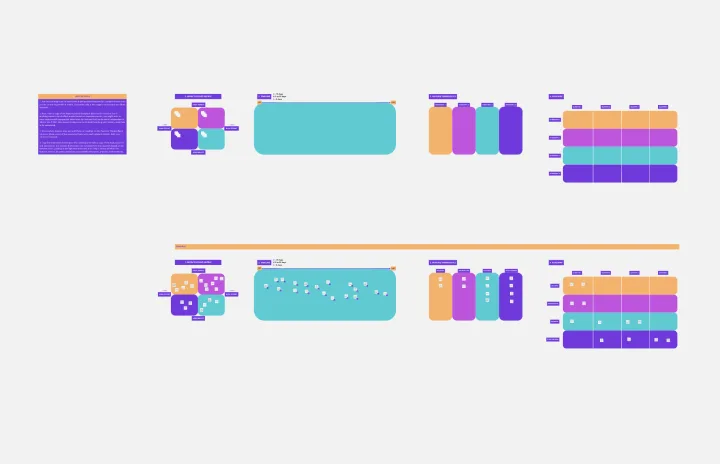
Epic & Feature Roadmap Planning
Epic & Feature Roadmap Planning template facilitates the breakdown of large-scale initiatives into manageable features and tasks. It helps teams prioritize development efforts based on business impact and strategic objectives. By visualizing the relationship between epics and features, teams can effectively plan releases and ensure alignment with overall project goals and timelines.
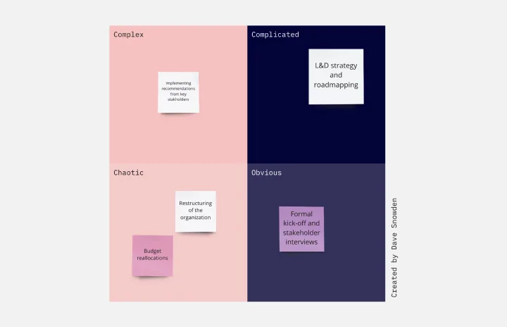
Cynefin Framework Template
Works best for:
Leadership, Decision Making, Prioritization
Companies face a range of complex problems. At times, these problems leave the decision makers unsure where to even begin or what questions to ask. The Cynefin Framework, developed by Dave Snowden at IBM in 1999, can help you navigate those problems and find the appropriate response. Many organizations use this powerful, flexible framework to aid them during product development, marketing plans, and organizational strategy, or when faced with a crisis. This template is also ideal for training new hires on how to react to such an event.