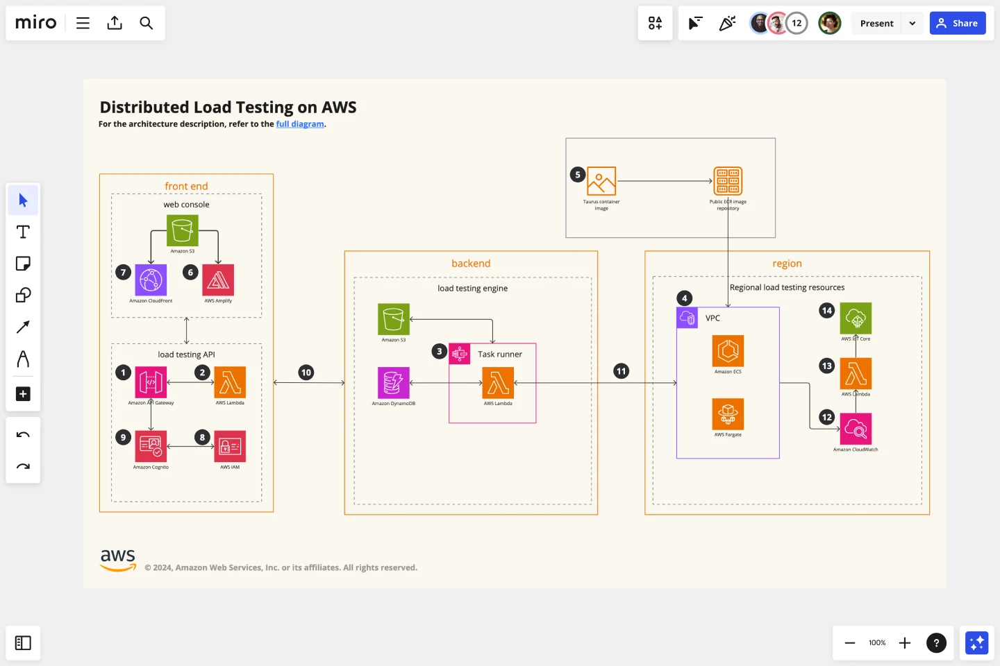
AWS Architecture Diagram Template
The AWS Architecture Diagram is a visual representation of the AWS framework, and it also translates the best practices when using Amazon Web Services architecture.
Trusted by 65M+ users and leading companies


About the AWS Architecture Diagram
The AWS Architecture Diagram is a visual representation of the Amazon Web Services architecture. AWS is a cloud web service designed for you to store data at a minimum cost. Government agencies, companies, and organizations often need to store their data securely without overloading the platforms, and with the AWS Architecture, they can ensure their cloud solutions are working smoothly.
Keep reading to learn more about the AWS Architecture Diagram Template.
What is an AWS Architecture Diagram Template
The AWS Architecture Diagram Template, like any other network diagram, visually shows the necessary steps of the architecture within AWS. The AWS Architecture Diagram has unique icons, symbols, and arrows that you can use for planning, designing, or auditing an architecture before or after deployment.
What are the AWS Diagram system elements?
The AWS architecture system key elements include:
Shapes: includes service, resource, or general resource icons from AWS.
Connectors: includes arrows that describe a flow of information or connect different parts of the diagram. They have a predetermined color.
Layout and grouping: the groups show the connection between multiple services or resources.
Styling and semantics: the colors mean the types of AWS functions and they are predetermined. When selecting an icon from the library, the right color will automatically be used.
When to use AWS Architecture Diagram Template
You can use the AWS Architecture Diagram Template to communicate and collaborate with your team. With the AWS Architecture diagram, you will be able to:
Identify single points of error
Design for fault-tolerance
Design for cost optimization
Build security into your design
Troubleshoot faster
Conduct security reviews
Prove and maintain compliance
Onboard new employees
IT professionals often use the AWS Architecture Diagram to easily see and evaluate the cloud infrastructure that supports the business or organization. There are specific logos and icons from Amazon Web Services that also are easy to identify and search, so you and your team can easily manage the system architecture. The main categories of the AWS icons are: compute icons, stage icons, database icons, and networking and content delivery icons.
How to use this template
To create your AWS Architecture Diagram in Miro, follow the steps:
Lay out the structure: select the groups to use.
Open AWS Icon Set to add Architecture service and resource icons.
Add other steps: Does your diagram include external users or devices? Use resources to add depth or context to your diagram.
Connect the steps with arrows: use the arrows to connect the steps and describe the workflow.
If you are interested in creating other network diagrams, Miro is the perfect network diagram tool with several available shape packs and templates to suit your needs.
How do I make an AWS architecture diagram?
Making an AWS architecture diagram in Miro is easy. You can use our AWS Architecture Diagram Template to and customize it as you see fit. Here’s how you can easily customize it: 1. Click on the “Diagramming” icon in the creation toolbar. 2. Click on the “More shapes” button. 3. Check the “AWS” to add it to your library. 4. Drag and drop additional resources, services, and containers as you see fit. 5. Use the Connection Line to connect related entities.
How is AWS architected?
The AWS Architecture Diagram framework has five pillars that describe the key concepts, design principles, and best practices for designing and running workloads in the Amazon cloud. See below these 5 AWS framework principles: Operational Excellence: runs and monitors systems to deliver business value Security: protects information and systems, keeps confidentiality and integrity of data Reliability: ensures the workload performs and recovers from failures quickly Performance Efficiency: uses IT and computing resources efficiently Cost optimization: avoids unnecessary costs, controls the money
Get started with this template right now.
BPMN Template by Pavel Kuksa
Works best for:
Diagramming
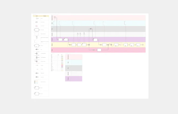
The BPMN Template, elements, and example template offers a comprehensive visual notation for modeling business processes using the Business Process Model and Notation (BPMN) standard. It provides elements for defining process flows, activities, and decision points. This template enables teams to document and analyze business processes systematically, facilitating process optimization and automation. By promoting standardization and clarity in process modeling, the BPMN template empowers organizations to improve efficiency, agility, and compliance in their operations.
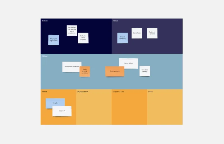
Cause and Effect Diagram Template
Works best for:
Diagramming
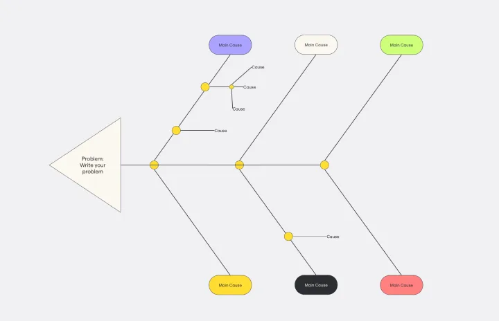
The Cause and Effect Diagram Template is a useful tool for analyzing complex relationships, identifying root causes of problems, and improving organizational processes. It can be customized to fit user's unique needs and provides a structured framework for analysis. Teams can use real-time collaborative analysis on the Miro platform to drive continuous improvement initiatives.
Supply and Demand Graph Template
Works best for:
Market Research, Mapping, Diagrams
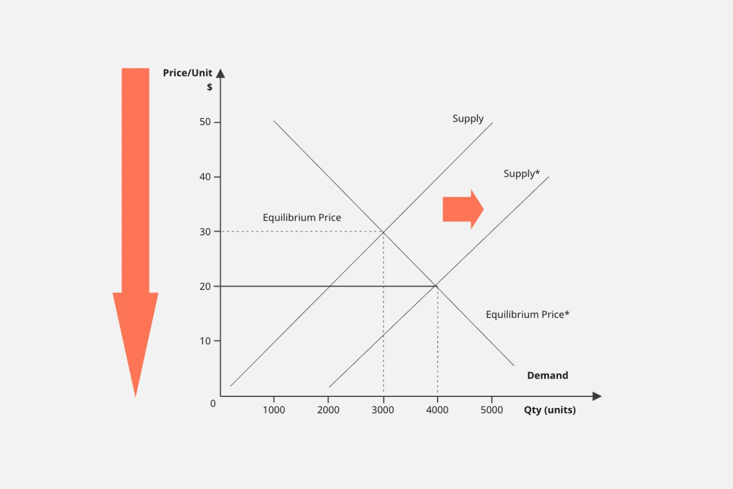
How do you price your product so that you make a profit while keeping customers and manufacturers happy? By finding a fair price. A supply and demand diagram is a graph that visualizes how much demand there is for your product and how many products you need. This, in turn, helps you with product pricing.
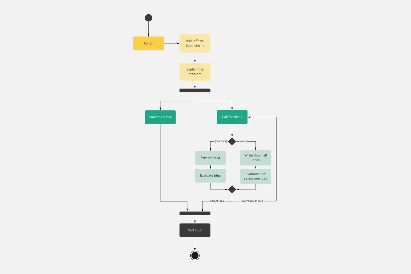
UML Activity Diagram Template
Works best for:
Diagrams
Use our Activity Diagram template to break down activities into smaller decisions and subprocesses. Improve and optimize systems and processes in I.T., business management, and more.
Kaizen Report Template
Works best for:
Agile Methodology, Operations, Documentation
What makes a great company great? They know that greatness needs to be fostered and maintained — meaning they never stop working to improve. If you’re one of those companies (or aspire to be), a kaizen report is an ideal tool. It creates a simple visual guide to continuous improvement activities on a team, departmental, and organizational level. Using a kaizen report approach, every employee in an organization audits their own processes and understands what they might have overlooked, making this a powerful tool for increasing accountability at all levels.
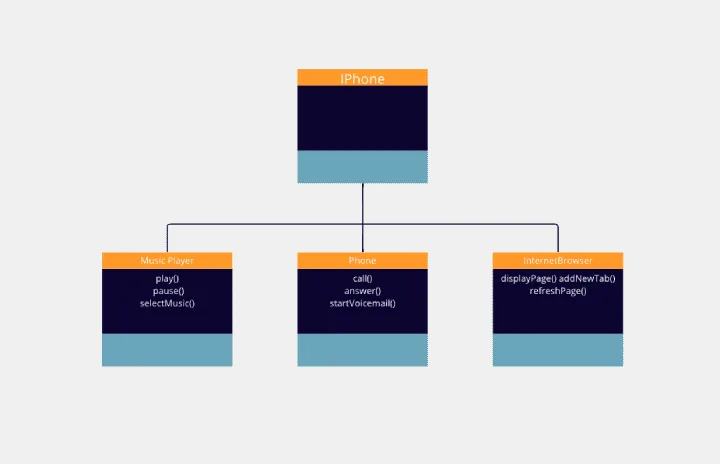
Challenge - UML Iphone
Works best for:
Diagramming
The Challenge UML Iphone template offers a visual framework for designing and modeling iPhone app challenges and solutions using UML (Unified Modeling Language). It provides elements for defining app functionalities, user interactions, and system architecture. This template enables teams to brainstorm ideas, document requirements, and visualize app designs, facilitating collaboration and innovation. By promoting clarity and alignment, the Challenge - UML Iphone template empowers teams to design iPhone apps that meet user needs and deliver exceptional user experiences.